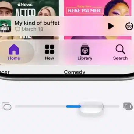
iOS 26.2 Finally Fixed Liquid Glass – Here’s How

Apple’s iOS 26.2 update delivers crucial refinements to the Liquid Glass interface, addressing key user complaints about the balance between aesthetics and usability that emerged with the initial iOS 26 release.
What Was Wrong with Liquid Glass?
Liquid Glass is a core design element in iOS 26, intended to make the OS more expressive with interactive visual effects that reflect and refract light. However, in earlier versions, readability—especially on the Lock Screen—often suffered in favor of the flashy aesthetic.
How iOS 26.2 Solves the Problem
1. Major Lock Screen Clock Improvements
Apple added new controls for the Lock Screen clock’s appearance to drastically improve clarity:
-
Go to your Lock Screen → long-press the wallpaper → tap Customize → tap the Clock.
-
You will find two new presets:
-
“Glass”: Refines the original look with better legibility.
-
“Solid”: Provides a completely opaque background behind the clock for maximum readability.
-
2. Enhanced Clarity Settings System-Wide
Apple now provides two main pathways to adjust interface transparency:
-
The Universal Method (via Accessibility):
-
Go to Settings → Accessibility → Display & Text Size → toggle on “Reduce Transparency.”
-
This blurs backgrounds system-wide to improve text legibility.
-
-
The Dedicated Liquid Glass Setting:
-
Navigate to Settings → Display & Brightness → Liquid Glass.
-
Change the setting from “Clear” to “Tinted.”
-
This mode increases opacity and adds more contrast, improving readability while preserving the distinctive look.
-
Conclusion & Personal Take
While Liquid Glass remains an aesthetic choice that may not suit all users or wallpapers, the tweaks introduced in iOS 26.1 and iOS 26.2—such as the new clock options and tinted mode—give users significantly more control to find their perfect balance between form and function.
The author notes that while they personally might avoid the “Clean” icon setting with certain wallpapers, the new improvements make it possible for almost anyone to find a comfortable setup without disabling the feature entirely. Users who have struggled with readability are encouraged to experiment with these new settings.